Basecamp
A journey from user research to high-fidelity prototypes, creating a comprehensive e-commerce solution for camping enthusiasts.
View the project on Behance
The problem
Inexperienced travelers struggle with purchasing camping gear due to lack of information, poor customer support, and inadequate accessibility.The Goal
Help inexperienced travelers confidently buy the necessary gear for their first camping trip.Explored the competitor landscape: Actors and competitors map

Competitors were mapped , both analog and digital, direct and indirect, to understand the landscape and identify market leaders and emerging trends.
In-depth actors and competitors analysis: Competitive audit
Insights from the competitive audit were collected, examining critical elements such as visual design, navigation, UI components, accessibility, voice and tone, and distinctive brand attributes.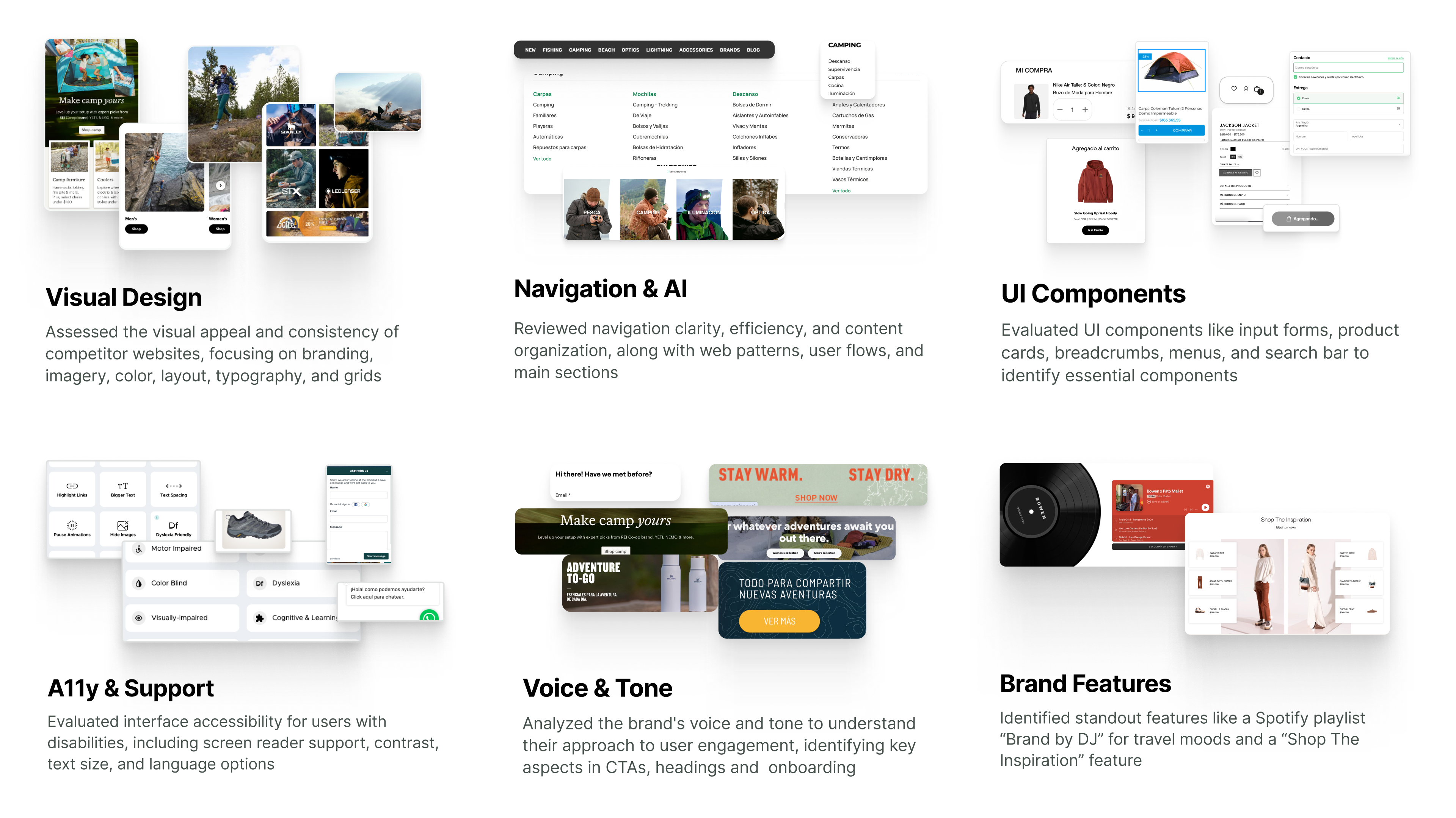
Trekking in user’s boots: User bios
User bios were created to embody target users, their needs, motivations, and pain points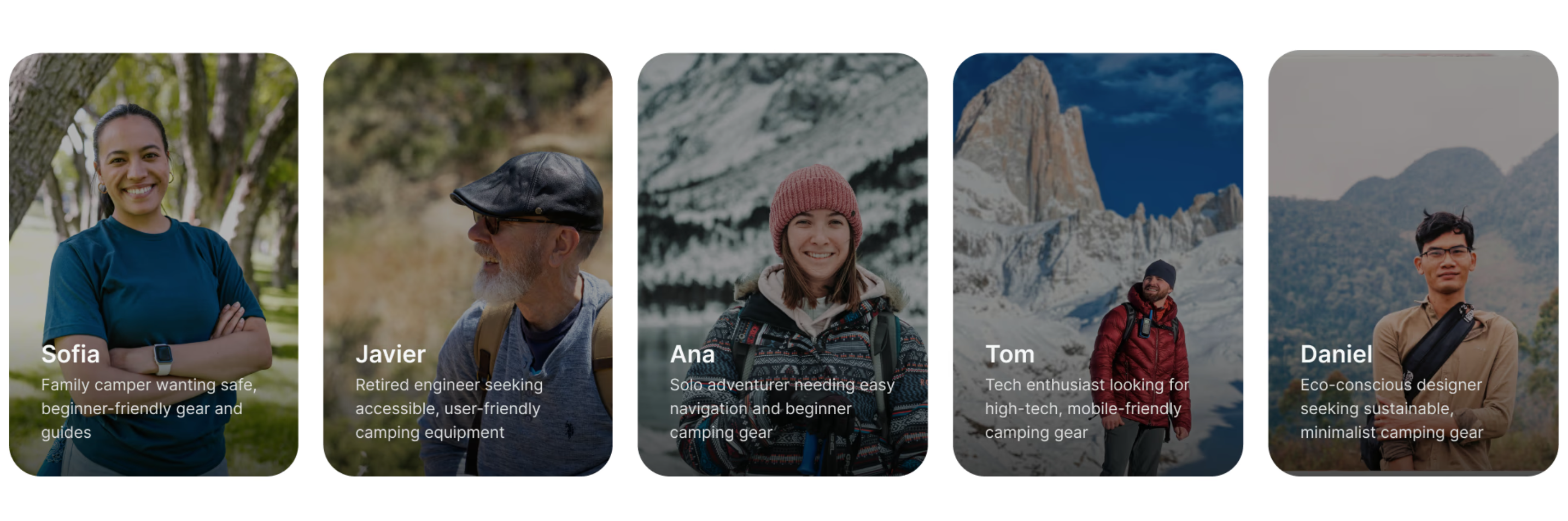
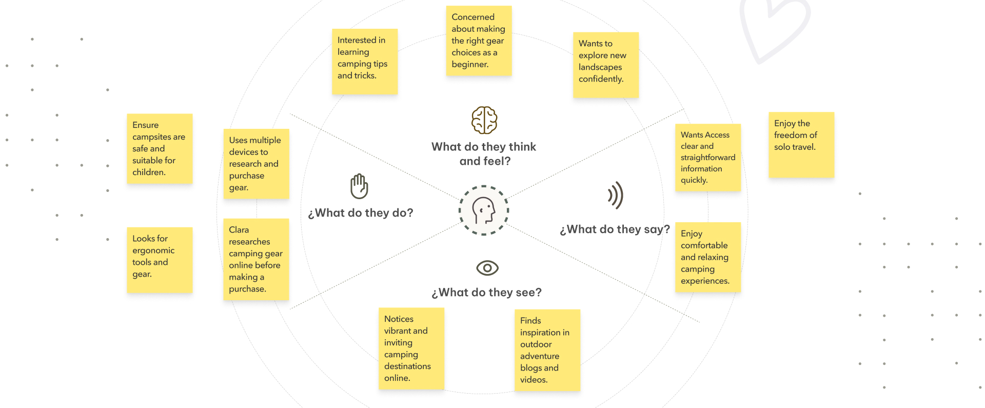
Sorted and mapped main findings: Empathy map
Identified the obstacles along the way: Pain points
Key user challenges were identified to guide strategic design decisions
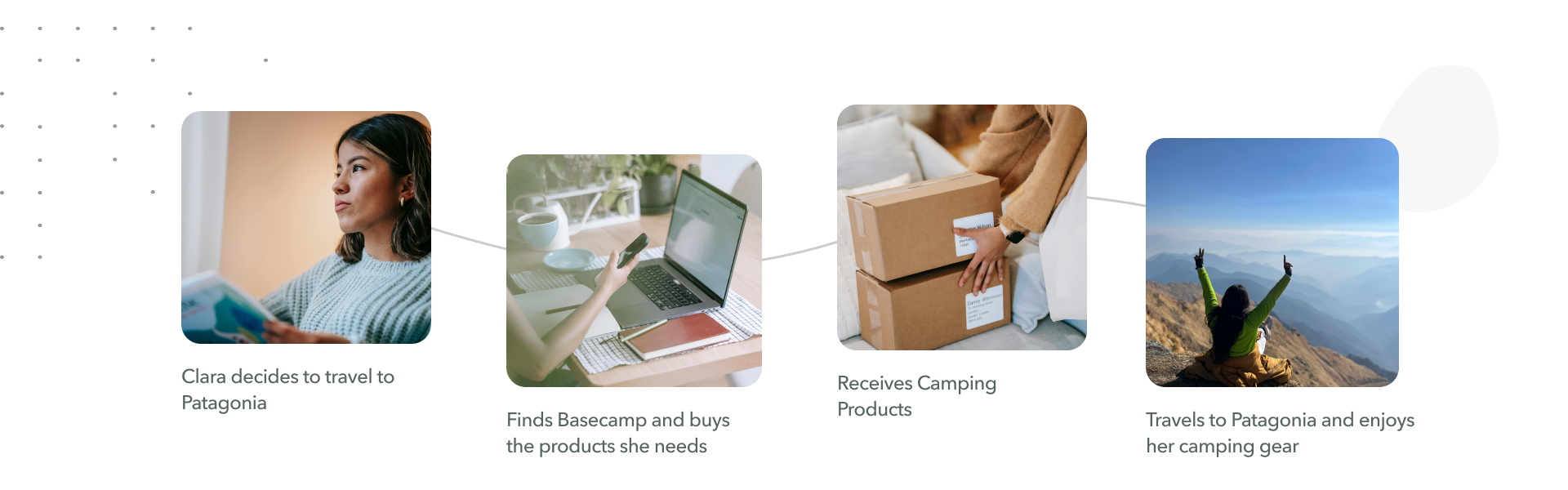
Meet Clara: Persona
Clara represents the User Persona where user stories and previously identified needs and pain points intersect.

How Might We help Clara obtain what she needs for her Journey?
A SWOT analysis , brainstorming and clustering sessions were conducted to generate and prioritize ideas for addressing user needs and pain points.

Mapping Clara's experience: User journey
Mapped Clara's trip planning to camping experience
Designed the primary path: Main user flow
Designed the primary user path from discovery to purchase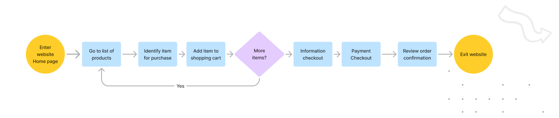
Sketched the Blueprint: Paper Wireframes
Crazy eights, brainstorming, and best practices were used to sketch initial layouts, focusing on key interactions and features.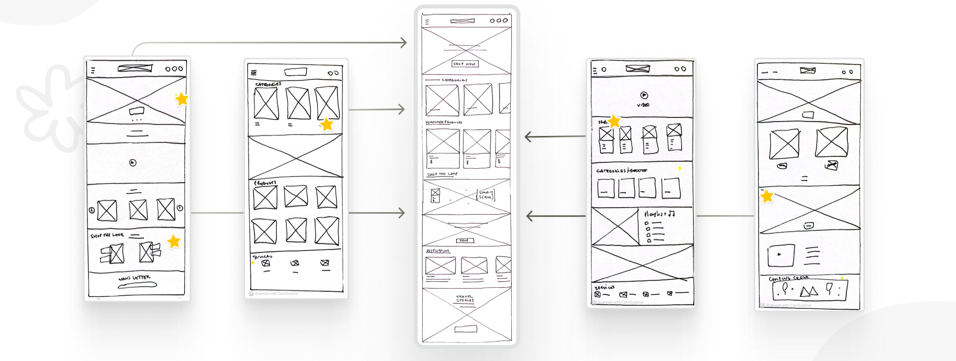
Translated Paper Sketches into Digital Wireframes
Translated paper sketches into digital wireframes to refine and iterate on design elements based on users needs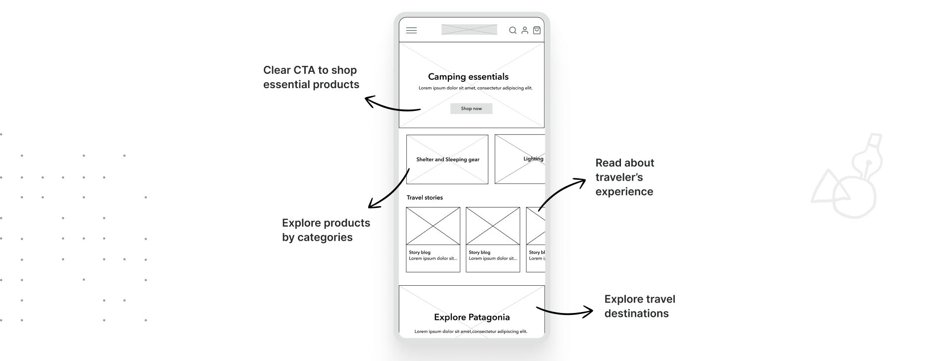
Created a basic interactive prototype: Minimum Viable Product
A Minimum Viable Product was designed to test initial concepts and gather early feedback
Tested the path: Usability testing
Nearly half of users abandoned the site on the second screen due to interaction issues with product cards and non-interactive elements. Enhancements were made to improve visual clarity, navigation, and CTA button visibility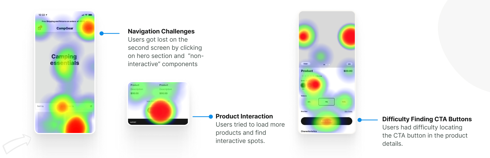
Improved the design: Iterations
Iterated based on user feedback, making adjustments to enhance usability and user satisfaction.
Designed the Voice, Tone and UI Kit
Designed the Voice, Tone, and UI Kit using atomic design and auto layout for efficiency and accessibility. The voice and tone guide Clara through the shopping journey, evoking a sense of adventure.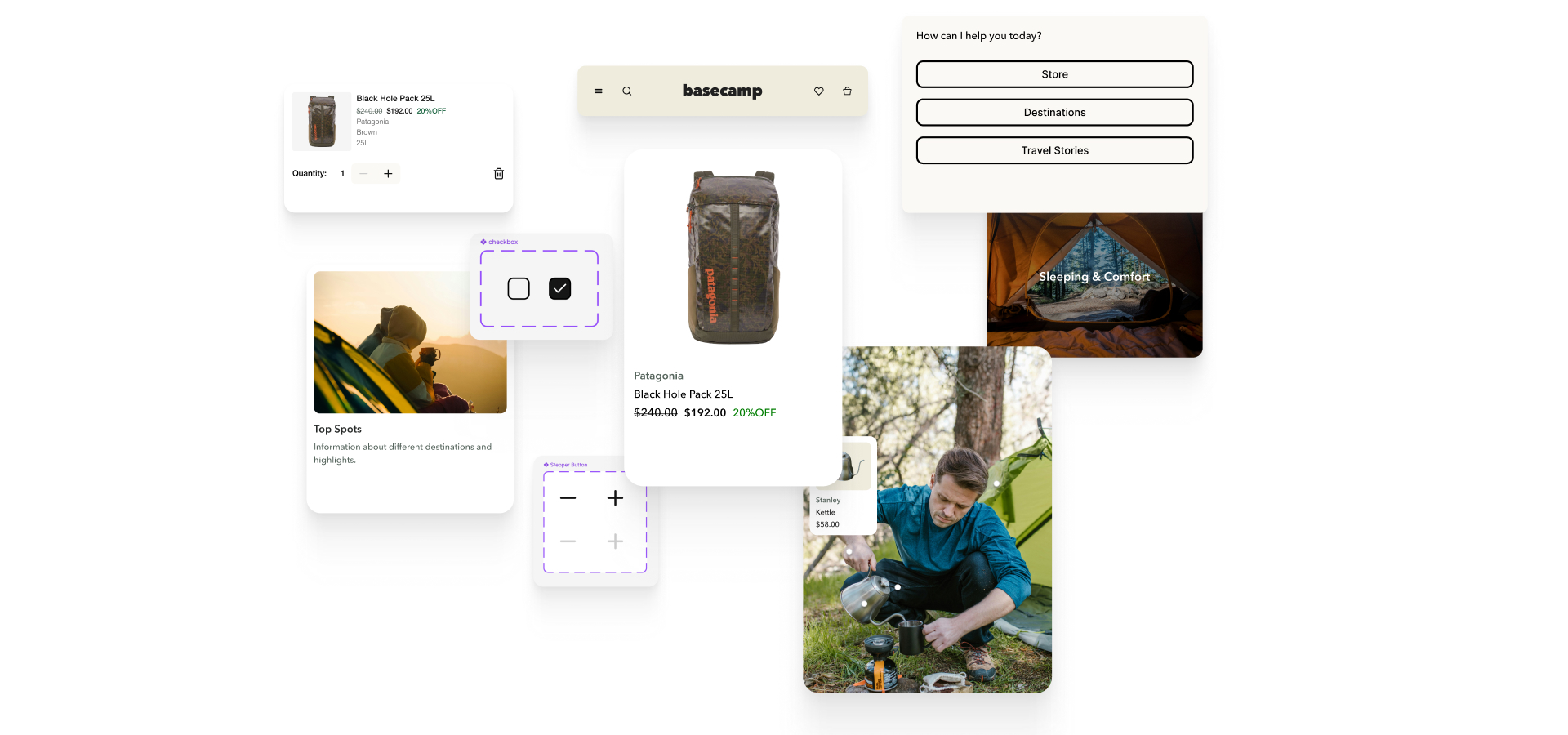
Selected Color Palette and Typography
The font selected was “Avenir Next” and the color palette, inspired by Patagonia, includes greens, browns, and empowering yellow for call-to-action.
Refining the design: Mockups
Accessibility considerations
Ensured designs meet accessibility standards, making the app inclusive for all users.
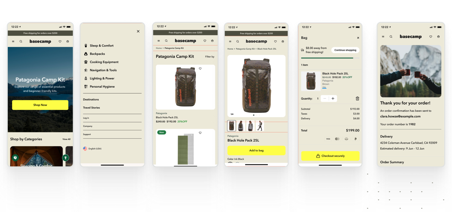
High-fidelity prototype
Takeaways
Understanding the market, user behaviors, and flow patterns was crucial for the design process. Aligning these practices helped create flows with minimal friction, providing users with a seamless experience and ensuring they have everything they need for an enjoyable journey.This approach also deepened my empathy by drawing insights from users' experiences with other platforms and provided valuable lessons to guide my approach in future projects.